Manuals/Dashboard Creator/UI Editor
Dashboard Creator: UI Editor
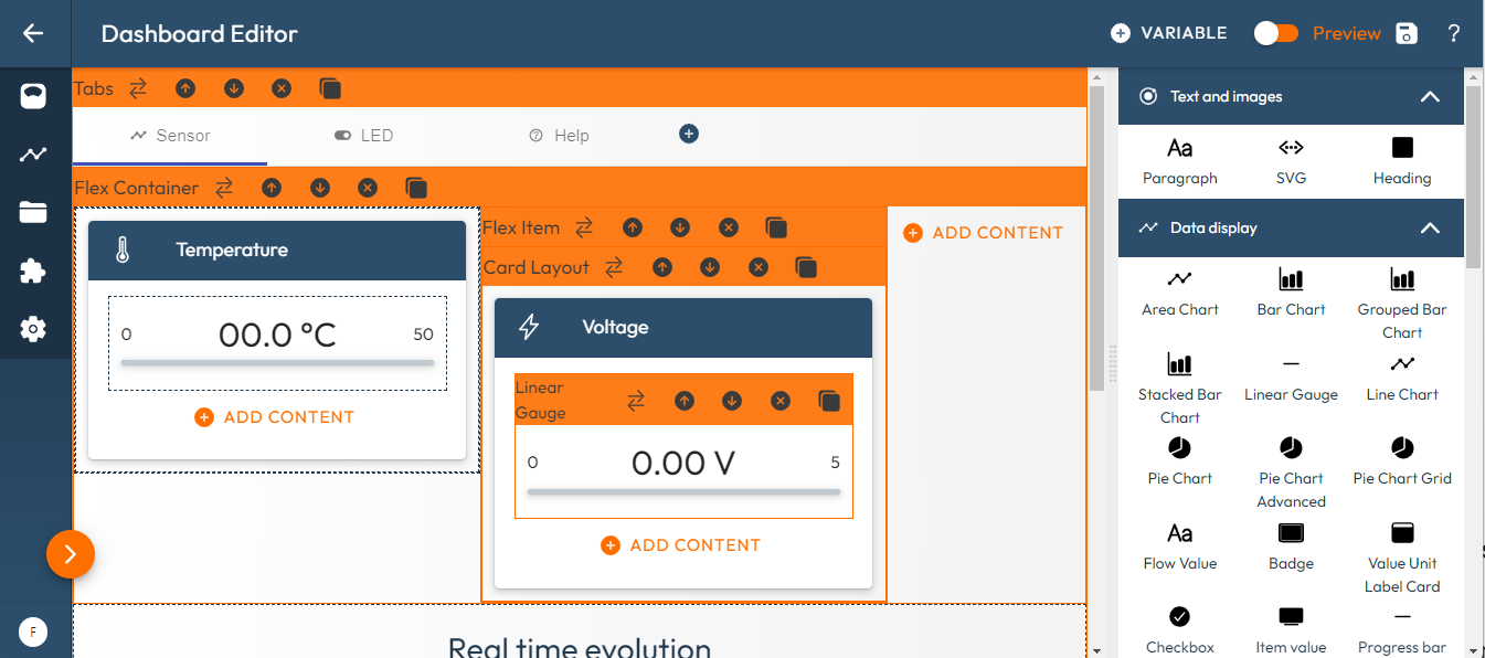
The UI Editor has two main parts:
-
The left side which represents by zone the user interface and the included graphical displays and controls.
-
The right side which presents the available graphical components. When a component is selected in the layout on the left side, the right side displays the configurable settings for that component.
Modes
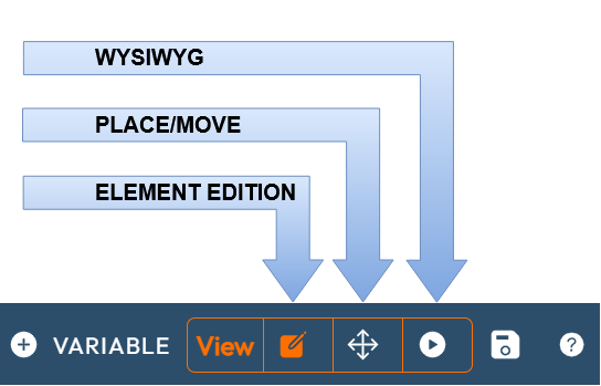
The UI Editor offers different modes that can be selected depending on the phase of development using the three buttons at the top right corner:
-
The Component Edition mode is best suited to modifying the characteristics of graphic components,
-
The Place/Move mode is recommended when organizing the page. In particular when using the 'Drag And Drop' function on the elements,
-
The Preview mode (WYSIWYG) allows you to see and test the final rendering.
Note that for all these modes, you can be connected to a target device or not. Being connected to a target is most relevant when you are in Preview.
Commands
The UI Editor is an interface for creating an HMI that runs as a mobile app. It is a Web App, but it must be used on a PC with a mouse. It can be run on a PC using most web browsers.
There are two main types of commands:
-
the general commands that are executed using the four buttons in the top right corner,
-
the editor commands that are executed in the Editor using a mouse.
General Commands
The four general command buttons are:
| Command | Description |
|---|---|
| Add variables | Imports variables from a resource file |
| Preview | Switches from to the Preview mode |
| Save | Saves the current project on the server |
| Help | Opens this help page |
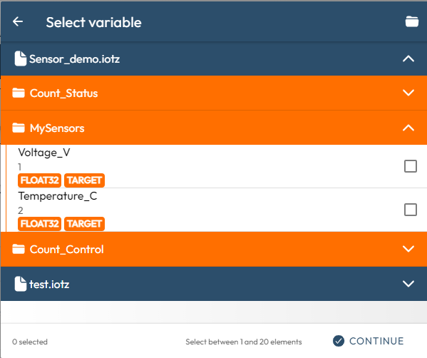
Adding Variables or Registers
The variables or registers are taken from the declared resource files for your target system. If there is no resource file, click on the folder icon to open one. Currently, Dashboard Creator accepts resource files that are formatted as one of the following standards:
-
ELF file (for variables in microcontroller applications),
-
CSV file (to manually add variables for any type of system),
-
DBC file (for CAN bus registers),
-
IOTZ configuration file from IoTize Studio. If you have already created an IOTZ configuration, we recommend using this format with Tap objects from IoTize.
IMPORTANT:
When selecting variables from ELF, CSV, or DBC, the variables are accessed through the Tap using their original addresses. This means that the direct protocols (SWD-direct, Modbus-direct, ...) must be available for the current profile.
When selecting variables from an IOTZ, the variables are accessed by their declared indexes in the Tap. For this reason, the accesses depend on the defined permissions of the current profile for the bundles which contain these variables.
We strongly recommend using an IOTZ file for a real application, and the other formats (ELF, CSV, DBC) only for developing a proof of concept. The ELF, CSV, and DBC files are used in IoTize Studio to create the IOTZ file.
After you have selected the variables, click on continue to import them.
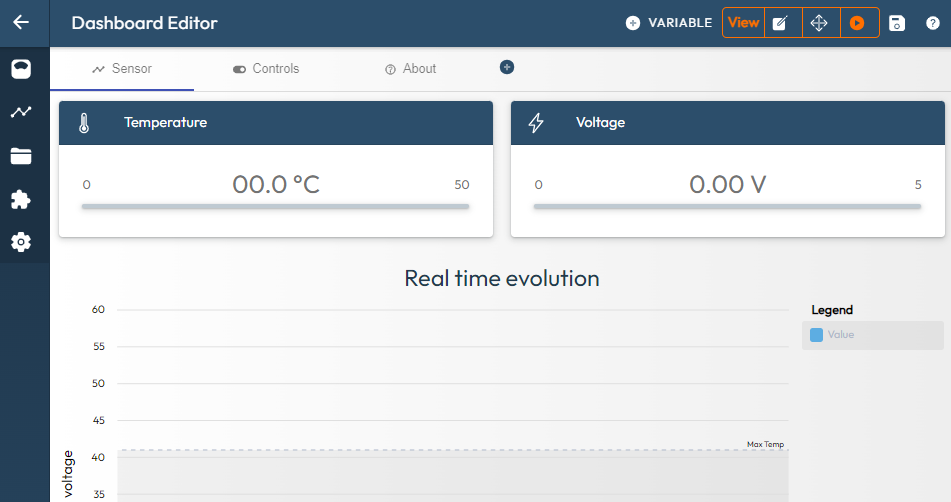
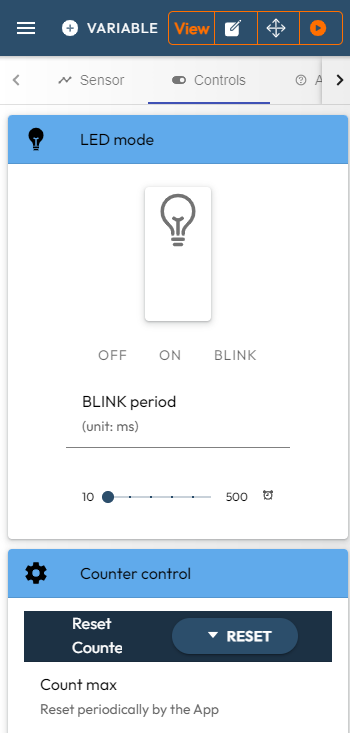
Preview Mode
Click on the Play button to hide the graphic components panel and see a rendering of your user interface app:
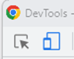
If you want the rendering size to match a specific mobile screen size, open the browser Developer Tools view (Shift F12) and select the phone display mode (Note: for Chrome this is the second button at the top left):
This adapts the view of the app to the size of a mobile screen:
Finally, it is possible to connect directly to the IoTize wireless device (TapNLink, Tapioca, TapNPass, etc.). The Sensor Demo corresponds to the standard configuration of the TapNLink Primers that you can use to get started.
To connect to an IoTize device:
- Click on the Select Device button in the left menu. This opens a menu where you can select from NFC, Wi-Fi/Socket, BLE, and MQTT. Only BLE and MQTT connections are allowed in Web App mode. We recommend using BLE with Chrome or any other browser that supports BLE. MQTT is possible but is more complex to setup. NFC and Wi-Fi/Socket are not supported by browsers.
After you select variables from a resource file, click on Continue to import them.
- Then select your IoTize wireless device (TapNLink, Tapioca, TapNPass, etc.). The BLE connection is made and the interface will display target system data when you are in Preview mode.
Save the Project
Click on the Save icon to store the project to your workspace on the server.
There is no Save As button. However, you can create a duplicate of your project. After you save the project, click Back to Home. Then, clink on the Clone icon in the panel for your project and select Duplicate in the pop up.
Editor Commands
For Components
Each graphic component in the layout has four button icons in left corner of its orange bar:
These icon buttons are:
| Icon | Description |
|---|---|
| Up arrow | Moves the element upward (when it is in a list) |
| Down arrow | Moves the element downward (when it is in a list) |
| Cross | Deletes the element |
| Pages | Duplicates the element |
Note that the Move actions only make sense when there are several elements at the same level that can be switched. If you want to move a component from one level to another, you can do it with a drag and drop mouse action.
Graphical Components
The two main types of graphical components are:
-
Layout components: these contain other components (display or layout). They allow you to create the structures of the pages of your mobile app. Layout components can be nested to several levels.
-
Display components: these allow you to display or modify values in text or graphic form (chart, gauge, field, button, etc.). Display components are generally placed inside layout components, but nothing prohibits placing a display component outside of any layout component.
Display Components
There are three types of display components:
-
Tap Managed Controls are components that must be connected directly to a variable on your device that will be read or written. They are easy to use when dealing with an editable variable.
-
Data display are components used to show data. This can be a variable, but in this case a TapNLink Value Extractor node has to be inserted in the Data Flow diagram between the variable and the Data display component. The TapNLink Value Extractor are automatically created when variables are imported so that the Data display components can be easily (automatically) connected to the variables.
-
Free control allows modification of a data value (not a variable!). This value could be redirected to a variable, but a TapNLink Variable Write node has to be inserted in the Data Flow diagram between the Free control component and the variable. If you connect a value instead of a variable, nothing will be reported to the device and the change will concern only the app.
The table below summarizes these characteristics:
| Type | Capabilities | Input |
|---|---|---|
| Data display | Read | Value |
| Free control | Write (and Read) | Value |
| Tap Managed | Write and/or Read | Variable |
Important note:
To summarize the description above, Tap Managed variables have several advantages over free controls components:
-
they synchronize writing with reading. It is more difficult to manage this synchronization well with free controls.
-
they correctly handle an access error when it occurs.
-
free controls require specific nodes to interface the variable with the GUI component (a value extractor when reading, or a TapNLink Variable Write when writing.
Adding a Component
To add a component to the layout, you can:
-
Press an Add Content button on the page. The list opens and you can select the new component,
-
Or select a component on the right, then drag and drop it on an Add Content button. This operation has to be done while in the Place/Move mode.
After you add a component, click to select it. The right panel will display the parameters for configuring it:
-
Structural section is used to show or hide the component depending on a value from the flow. This is used, for example, to hide certain components when equipment exists in different versions with certain functionalities that may or may not be present. The read reference of the equipment type will hide/show the non-existent components linked to these functionalities. In this section there is also a 'name' field which allows you to identify each element in a comprehensible way. We advise you to use this field which, by default, contains a generic name.
-
Help provides information about the component and its configuration parameters.
-
Settings contains the list of parameters to configure for the graphical component. Some components come from open-source libraries and a link is then provided in Help where you can find more complete information.
Parameters
There are several types of graphical component parameters:
-
Text (ex. for a title), a numerical value (ex. for the font size), a checkbox (for a boolean value), or selection lists for choosing among several options (ex. left, right, center, or justified for paragraph alignment).
-
Icon field to choose from a list of ionic's predefined icons.
-
Or a stream entry. Often a stream input can be replaced with a constant value. For example, this is often the case with colors, which can be specified absolutely, or introduced as a value from the stream. This is used to modify the color of a graphic object according to the displayed value.
Multilingual support
Text entries can either be considered as constant inputs or refer to entries in a multilingual dictionary. The list of entries in the multilingual dictionary is to be defined in the 'multi-language' section of the main menu. When the dictionary is displayed, you can:
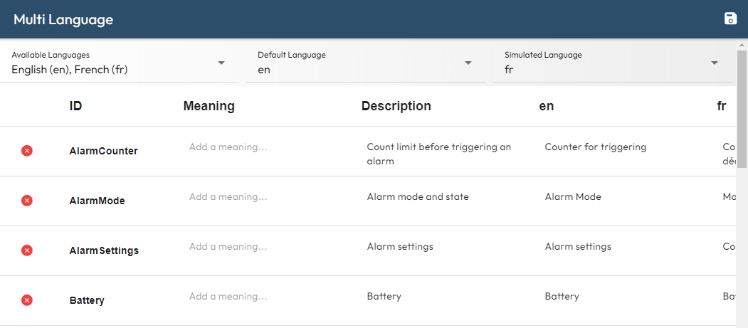
-
Define the list of supported languages. If the language of the device (for the final application) is present in this list, the texts in the corresponding column will be used.
-
Set the default language. This will be the language used when the language of the device does not correspond to any of the supported languages,
-
Set the simulated language: this is the default language used in 'App Editor'. So you can change it simply for testing purpose without having to change the default value.
-
And of course define the list of translations for each entry.
In the component settings, you can then click on Translation and select the entry that suits the text being edited.
Layout Construction
Organizing an HTML page often comes down to nesting vertical and/or horizontal windows. We can see this in the example below:
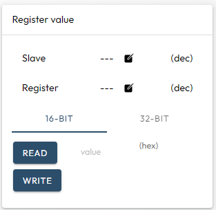
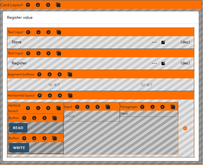
These images show the same area in Preview mode and Place/Move mode. In the Place/Move mode, we see how the different components are nested. Typically, the two Read/Write buttons are inserted into a Vertical Layout which is inserted into a Horizontal Layout which is inserted into a Card Layout.
Organizing components is easier in Place/Move mode which allows you to:
Add a Layout Component
As seen above, we can perform a 'Drag and Drop' action from the list of layout components or click on the Add Content button at the location where we want to place the new component:
Move a Layout Component
To move a set of components from one location to another, you can use the drag-and-drop method. It the sequence below, we see how to move the Result area in the new Card Layout:
However, it is sometimes difficult to activate the destination place, in particular when the destination container is empty. In this case there is workaround. With the popup menu, you can Select the object to move, then Select again the destination container and run the Move selected command as demonstrated below:
Responsivity of the layout components
All the components are responsive. This means that they automatically adapt their size and position according to the available space. The layout of the screen will therefore depend on the dimensions of the phone and it is important to carry out tests on various screen models before releasing a mobile application. Another effect is also that a 'horizontal layout' element could display its content vertically if the horizontal space is not sufficient. There are many behaviors that may surprise you, but generally speaking, the Ionic environment allows you to build correct renderings in most situations. It will often be a matter of choosing the right layout element (or the right nesting) to obtain the desired result.
Component Description
Most of these components are those defined in the Ionic libraries and their original documentation can be found in the Ionic manuals.
Layout
These components are containers that allow you to organize the layout of different pages. They contain one or several low-level components, but they can also accept other layout components as nested children.
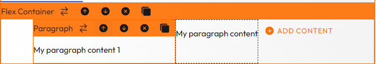
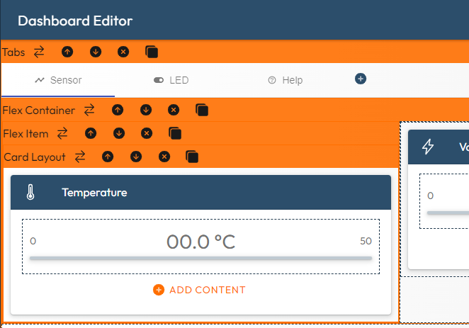
In the image below, a Card Layout is inside a Flex Item that is inside a Flex Container that is inside a 'Tab'.
Accordion Groups and Elements
Accordions provide collapsible sections in your content to reduce vertical space while providing a way of organizing and grouping information:
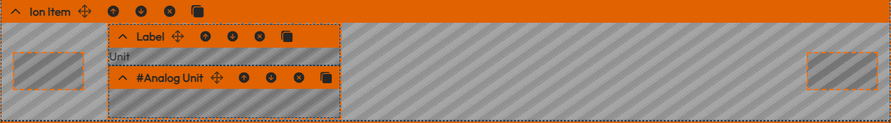
ion-item
ion-item are ionic elements that can contain text, icons, avatars, images, inputs, and any other native or custom elements. Generally they are placed in a list with other items. They are often used to propose a list of various settings. The proposed implementation contains 3 subcontainers:
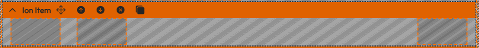
The role of this 3 subcontainers should be:
- The first subcontainer (on the left) is intended to received icons
- The second subcontainer (on center) is intended to received one or more text elements (Inputs, text, select,...).
- The third subcontainer is intended to received graphic components such as button, toggle, ... or icon.
Note that a subcontainer can accomodate several elements:
Horizontal and Vertical Layouts
These containers concatenate elements on a row or on a column. However, the horizontal layout will present the elements vertically when the width is not sufficient.
Flex Containers and Flex Item
These are the same as horizontal/vertical layouts but offer more flexibility and options. The container is able to arrange dynamically the inner elements according to various constraints.
Tabs
Tabs are a top level navigation component to implement a tab-based navigation. The tab element can be inserted from the settings panel. Adding a new tab element is possible either in the Preview ('+' button), or in the settings panel.
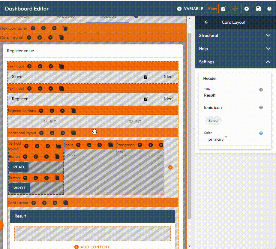
Card Layout
A card is a container made up of a header for a display title. The contents itself can be a single element or another layout element.
Text and Images
These are static components, used to display titles, help, or decorations.
Paragraph / Heading / Label
These 3 types offer various features for text formatting. They have options to select color, font size, alignment,...
Paragraph also accepts input from the dataflow diagram (or from the multilingual dictionary).
SVG
SVG are generally used to display images.
The file is editable because it is often useful to adapt the original size.
Managed Tap Controls
These controls embed an interface control for the hardware. They accept variable objects as input. Note that the variable could be used either for a read, a write or a read and modify action).
Unlike the Free control and Data display categories, they globally manage cases of errors when accessing TapNLink variables. Typically, a red symbol is displayed in the corner of the object when a write operation has failed.
Config Item, Tap Connection State, Tap Login
These are predefined components that are useful for connection/login to a device, and to specify different settings. Note that these actions could be done by running a lwM2M command from the Data Flow. However, as a first step it is much easier to use these high-level objects.
Bits
This component is used to display in the form of a series of LEDs the different bits of a word read from a TapNLink. A label can be associated with each bit.
Bits can be editable or not.
Buttons
Buttons work like radiobuttons in Windows: they are generally used to select a single value from a set of possible values.
Select
Select work like listboxes in Windows: they are generally used to elect a single value from a set of possible values. Select is more appropriate than Buttons when there are a large number of options.
Color, Date&Time
These are classic pickers allowing the selection of a color, a date or a time.
Text Input, Number Input
Both allow you to enter a value. Text will open a full keyboard while Number will only open a numeric keyboard.
Data Display
These are a variety of GUI elements that display data, including charts or gauges.
Their input values cannot be variables, but raw values. To display the contents of a variable, insert a TapNLink value extractor node between the variable and their input. Note that this extractor is usually inserted automatically by the UI Editor when the variable is imported.
Charts
The charts are component issued from the ngx-charts open source library. A chart must be filled in the dataflow by a tabulator that can be:
-
a single serie chart data,
-
a multi-series chart data.
The type of the tabulator depends on the type chart. For example, a bar graph would be filled with a single-serie node.
More documentation can be found on the ngx website
Table
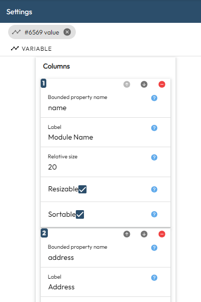
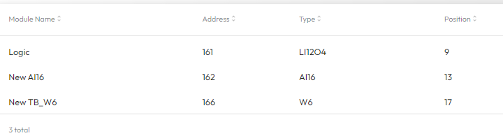
table is not a standard ionic component. It allows to display a table with different columns. The input, defining the list of the rows, must be a JSON array coming from a flow-variable. This array contains objects where the keys have to be found in the defintion of the columns. For example, the JSON array below contains 3 elements with 4 keys: 'name', 'address', 'pos' and 'type'.
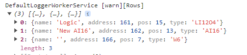
These keys are defined as 'Bounded property name' in the definition of the columns:
and they the elements will be displayed as a table organized in 4 columns:
Free Controls
The free controls are generic components used to modify application values. If it is a question of modifying variables of a TapNLink; it will be better to go through a Tap Managed Control.
However, it is sometimes necessary to go through a free control, if only because you want to modify the value to be written to the Tap variable. You must then use a TapNLink Variable Write node as in the example below:
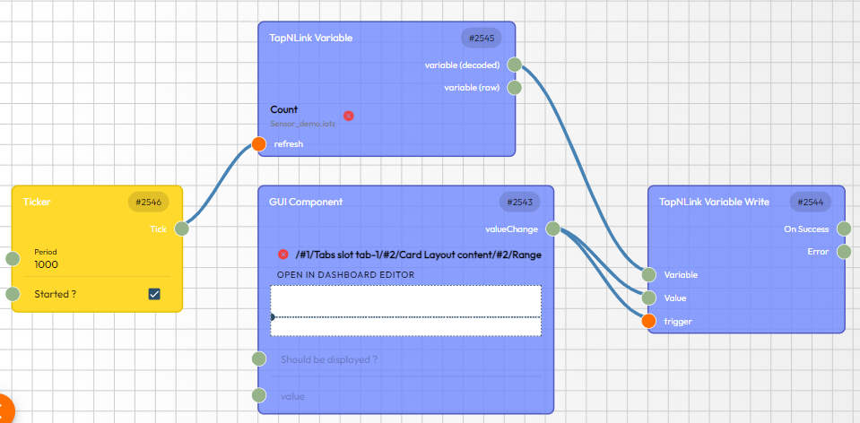
In this example, the value modified by the Range control will be multiplied by 10, then written to the variable Count. Note that the write operation is performed only when the Range position is modified.
The free controls also provide more graphical settings than the Tap Managed controls. Thus, they can be preferred when more sophisticated rendering is required.
Buttons
A button is a single element that allows you to trigger an event.
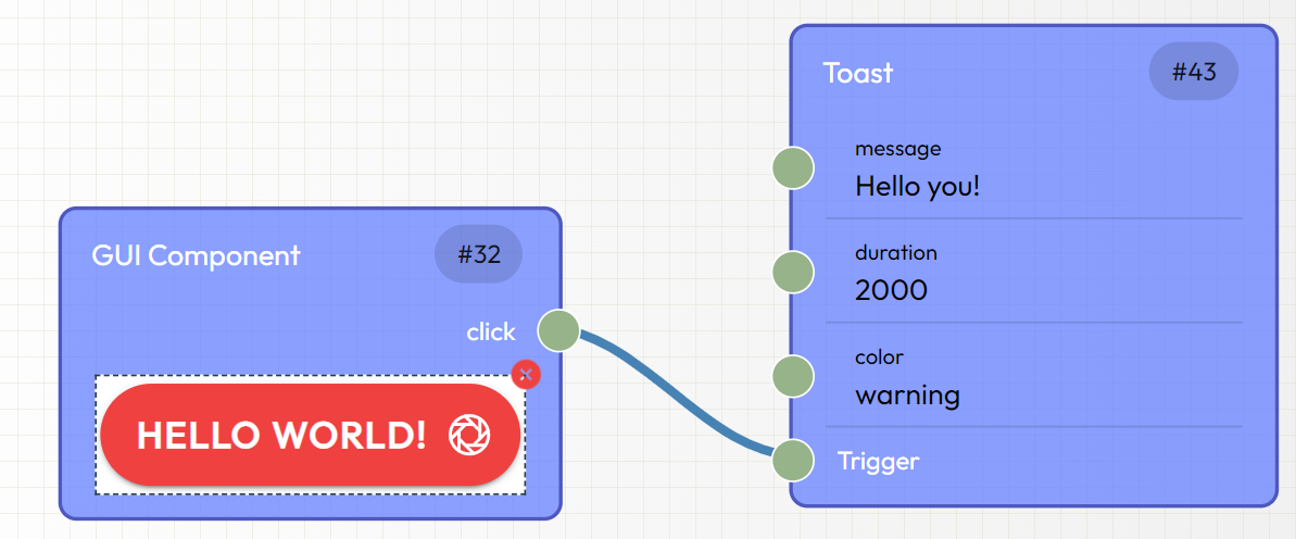
The Click output can be used in the dataflow diagram to trigger any node(s).
FAB container
A FAB container will present one or several iconic buttons (e.g. FAB button). Each FAB-button could generate a signal in the data flow.
Input and Textarea
A generic input field that offers many tuning options. When the value is modified, a signal will propagate the new value to the dataflow as output. Note that the 'type' selection preset the configuration of the associated keyboard/keypad and display (numeric keypad for a number, hidden characters for a password, etc). In addition, Textarea offers a multi-line mode.
Range
A linear slider.
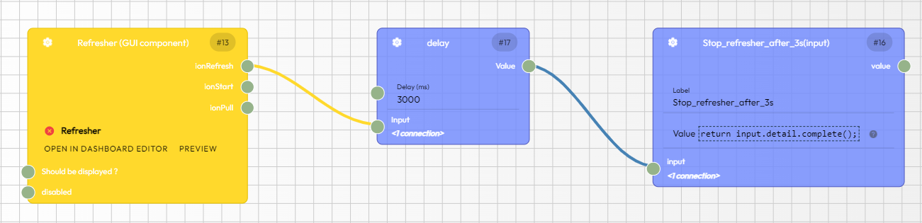
Refresher (Pull-to-refresh)
Refresher provides pull-to-refresh functionality on a content component. The pull-to-refresh pattern lets a user pull down on a list of data in order to retrieve more data.
Data should be modified during the refresher's output events. Once the async operation has completed and the refreshing should end, complete() needs to be called on the refresher.
Example : in the flow below, the refresher will be stopped after 3 seconds by the call to the 'detail.complete()' method (this call is put into from the unary-inline block on the right).
Segment Buttons
Segment buttons are a set of related buttons inside of a segment. They are displayed in a horizontal row. A segment button can be selected by default by setting the value of the segment to the value of the segment button. Only one segment button can be selected at a time.
They are often assigned to an enumeration type. Sub-buttons can be declared in order to present the list of the possible values.
Toggle and Check
Toggle and Check are switches that change the state of a boolean option. They can be switched on or off by pressing or swiping them.
Both can be used either to display and/or modify a boolean. Several settings/inputs are available for the Check component.
They must be used in combination with a Label (or any text field). The output (Value change) can be transmitted to a node of the dataflow.
Progress bar
Progress bars inform users about the status of ongoing processes, such as loading an app, submitting a form, or saving updates. There are two types of progress bars: determinate and indeterminate.
Determinate is the default type. It should be used when the percentage of an operation is known. The 'percentage' must be in the range [0,1] The progress is represented by setting the value property.
The indeterminate type should be used when it is unknown how long the process will take.
Advanced
HTML
Two different methods are available to insert proprietary (dynamic) HTML code in your Apps:
- either you edit directly inside the HTML component,
- or you build its contents outside (for example within inline nodes) and you import the resulting HTML code as an input variable.
Both methods are presented in the sample described in the documentation.