Manuals/App Creator/Getting Started
Improve your App
Edit the layout of the Tabs
For each tab, we can now improve the resulting display. It becomes a question of taste and of time.
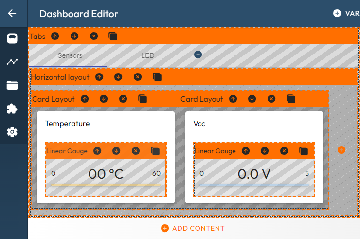
Sensors tab
Let's use the same 'gadget' for both the temperature and the voltage. We can keep the two cards, then replace the existing displays by linear gauges and place these cards into an horizontal layout.
We have to configure the Linear Gauges as follows:
- for Value, click on the 'List' button and select select 'var/tap/temperature-c-id-2/value',
- for Unit, enter '°C',
- for Min and Max, enter 0 and 50.
- for DigitInfo, enter '.1-1' . The format for the real numer is a.b-c where a is the number of digits before the decimal point, and b/c are the minimum/maximum number of digits after the decimal point. In our case, we don't specify the number of digits for the integer value, and consider exactely one digit for the digits after the point value.
Then we repeat the same sequence for the voltage with 'V' as Unit, '5' as Max and 'var/tap/voltage-v-id-1/value' as stream.
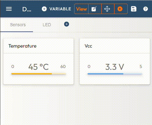
We obtain:
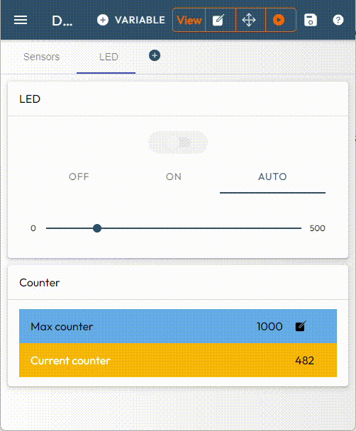
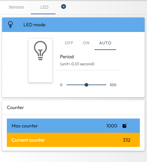
LED tab
This group of variables manages both a generic counter and a LED. Let's organize the variables with two sets of cards to consider at the top the LED related variables, then the counter related variables:
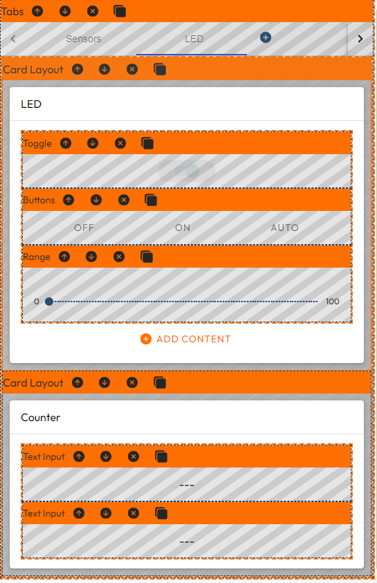
For the Counter group, we first select some better graphical components.
In the Counter group, we edit the two components in their Settings panel:
- reintroduce their names in the Label field,
- change the background colour,
- set Count Max as Editable.
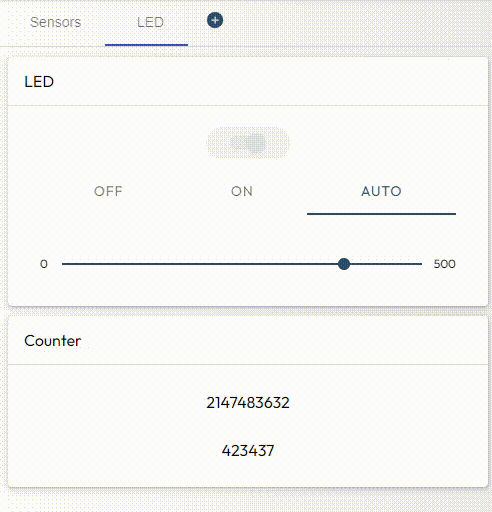
For the LED group, we will build the layout as done in the 'Sensor Demo' example:
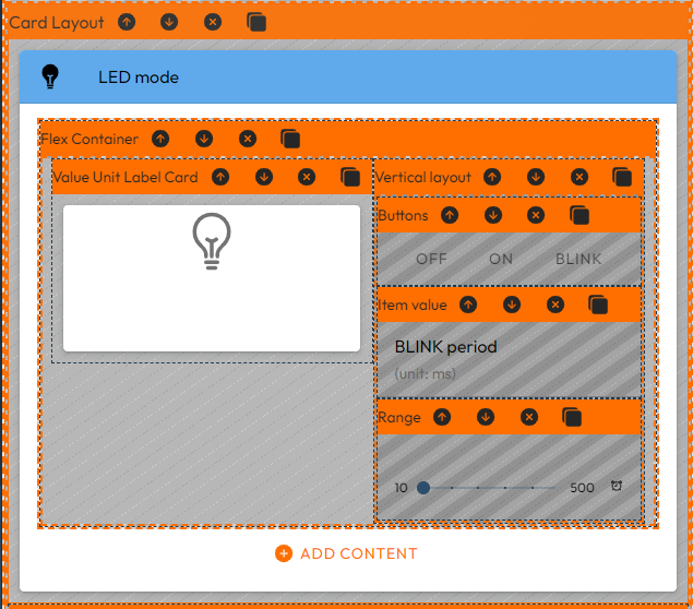
To do so, we execute the following operations:
-
We rename the group as 'LED mode' and add a bulb as icon. We also specify a background color. All these operations are done in the Settings panel if the Card layout.
-
Then we add the layout components: a Flex container, then (inside the FLex container) both a Vertical layout and a Value Unit Label Card:
-
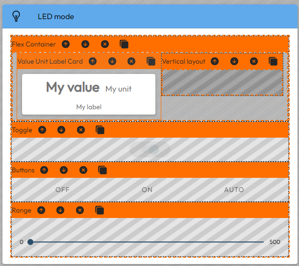
We move the Buttons and the Range components inside the Vertical layout
-
We delete the Toggle component and add a Item Value between the Buttons and the Range components.
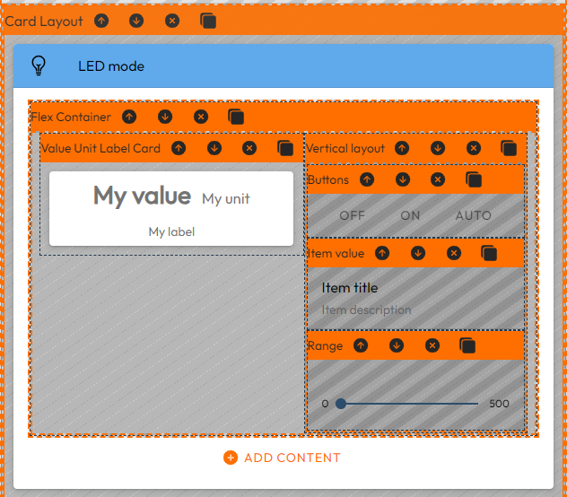
- We edit the Settings of both the Item value and specify the bulb icon for the Value Unit Label Card. We can also increase to 5em the size of the icon.
We want now to adapt the color of the icon to the state of the real LED. For this, we need to edit the Dataflow diagram.